Design2025
Brand identity
A holding's brand redrawn, from word to building



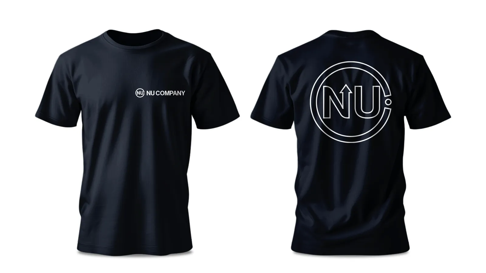
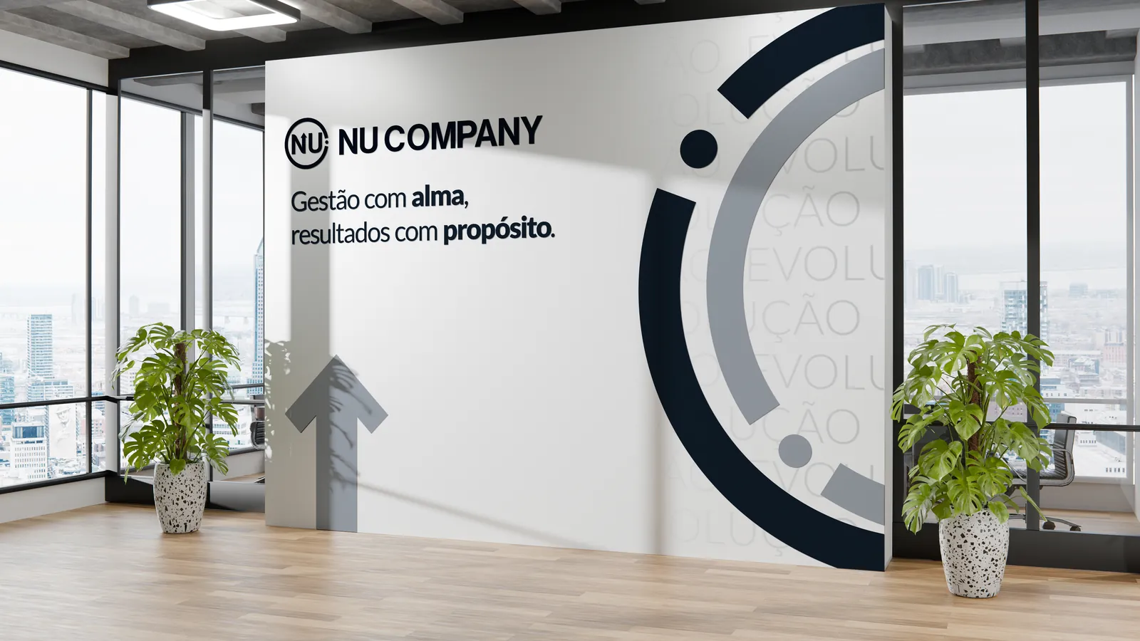
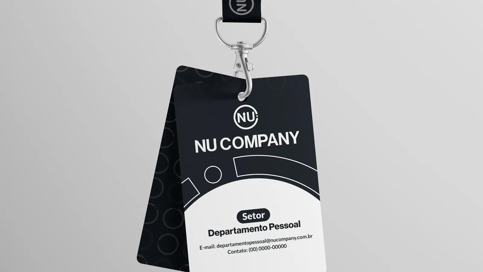
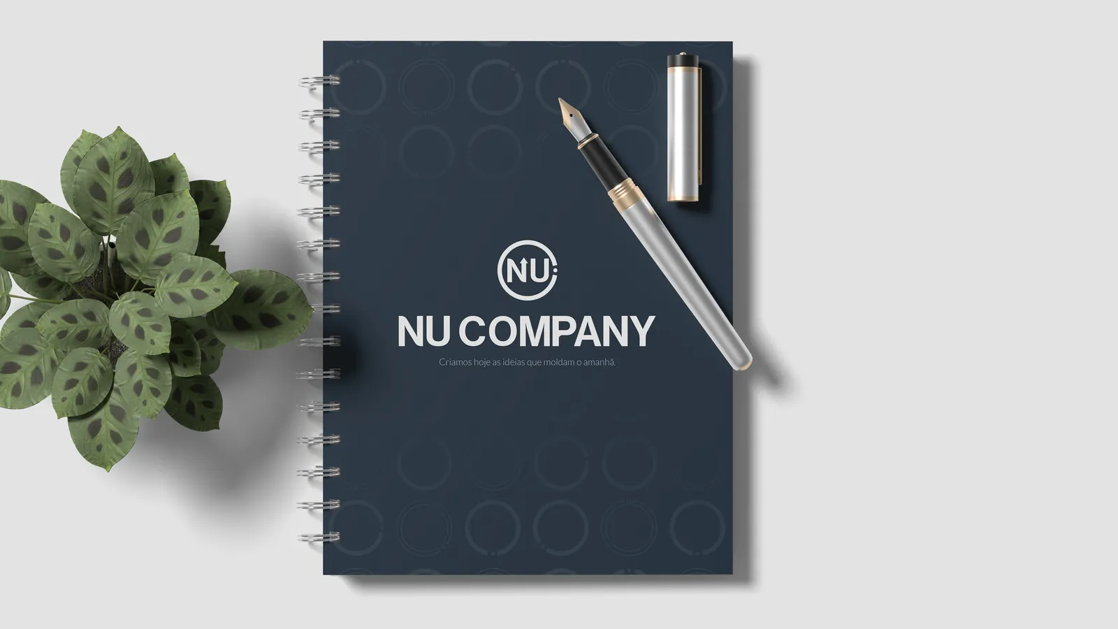
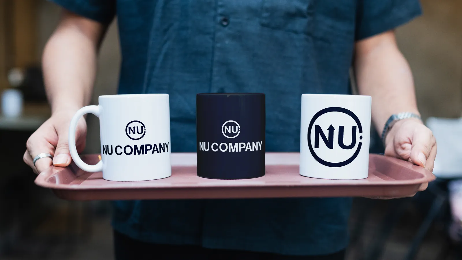
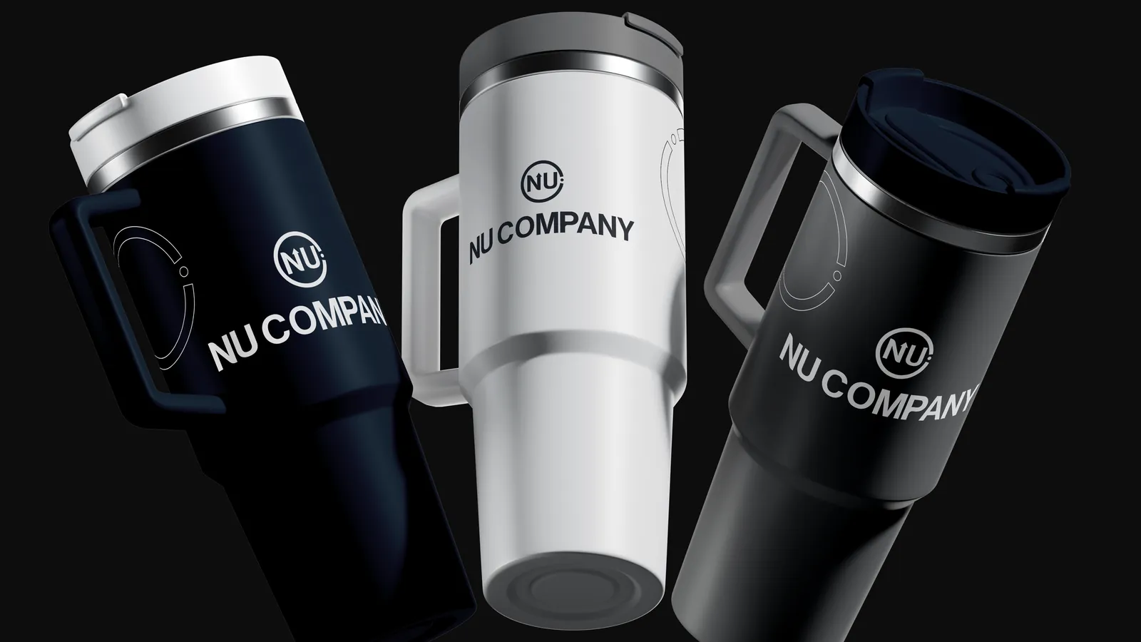
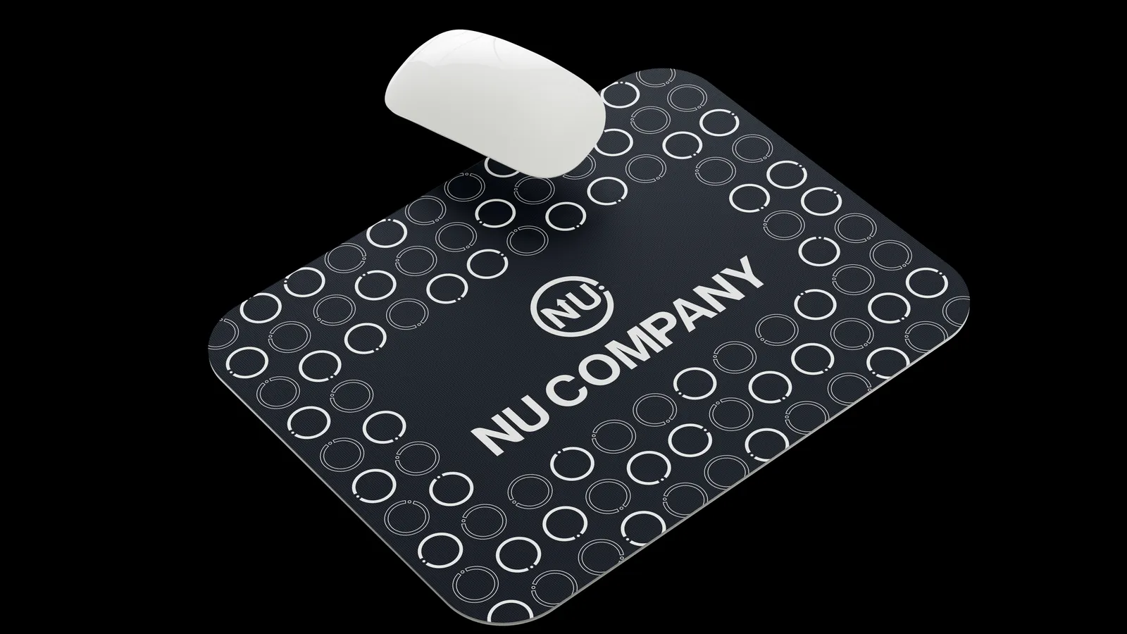
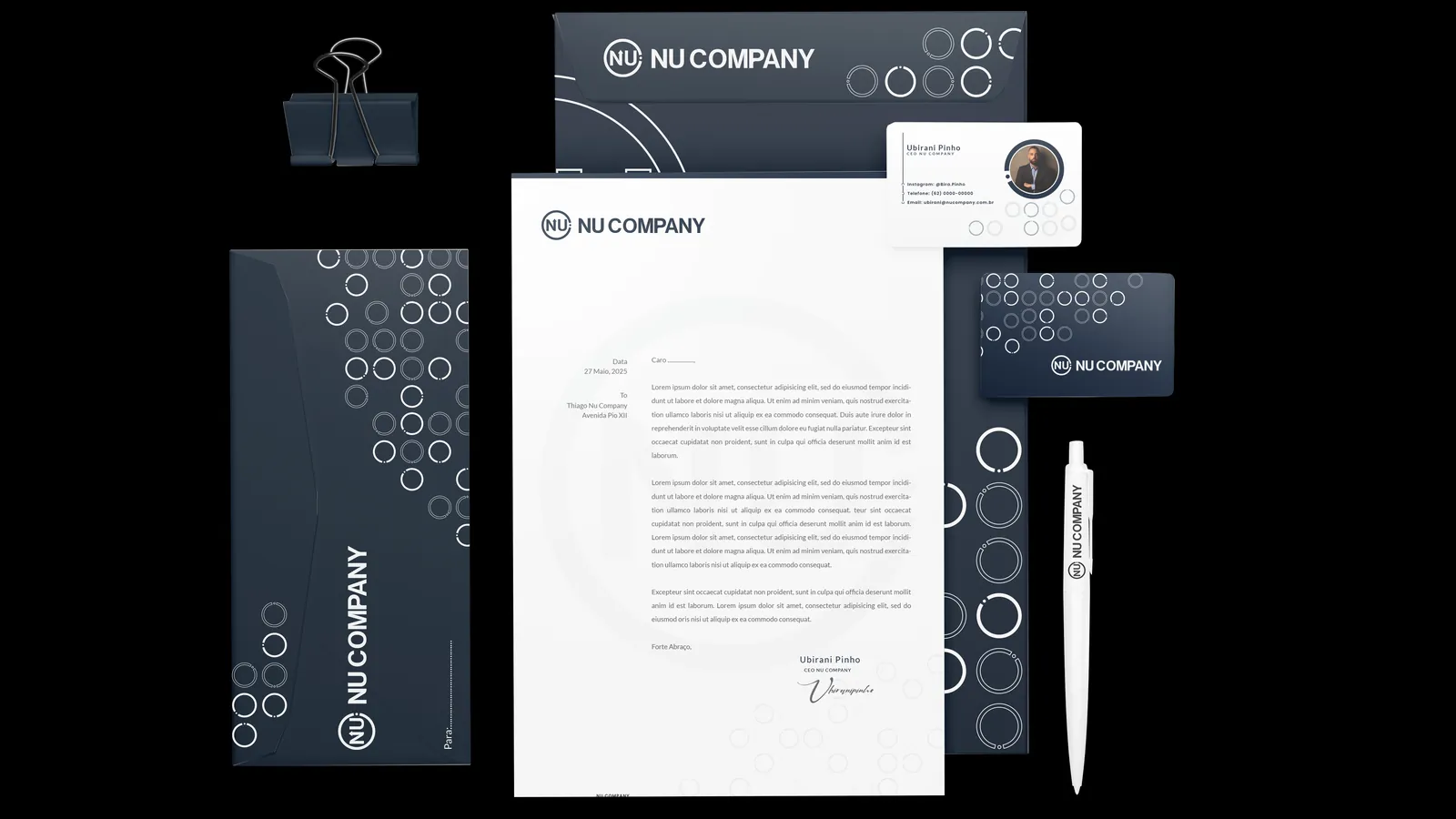
NU Company is a holding with subsidiaries, and the old brand did not carry that role. I drew the symbol out of the word itself: the stem of the N became an ascending arrow, and the semicircle around it closes the C of Company into a ring. That decision settled the rest: the ring became the brand's graphic pattern, and the palette was locked in Pantone because almost every application is physical. Delivered as a brand manual, logo versions and the applications.
Process
The word became the symbol
The brief was to show continuous growth without losing the sobriety of a holding, which is the shortest road to the corporate-slide arrow. Instead of drawing a symbol next to the name, I went looking for the symbol inside the name: NU was already what the company called itself internally.
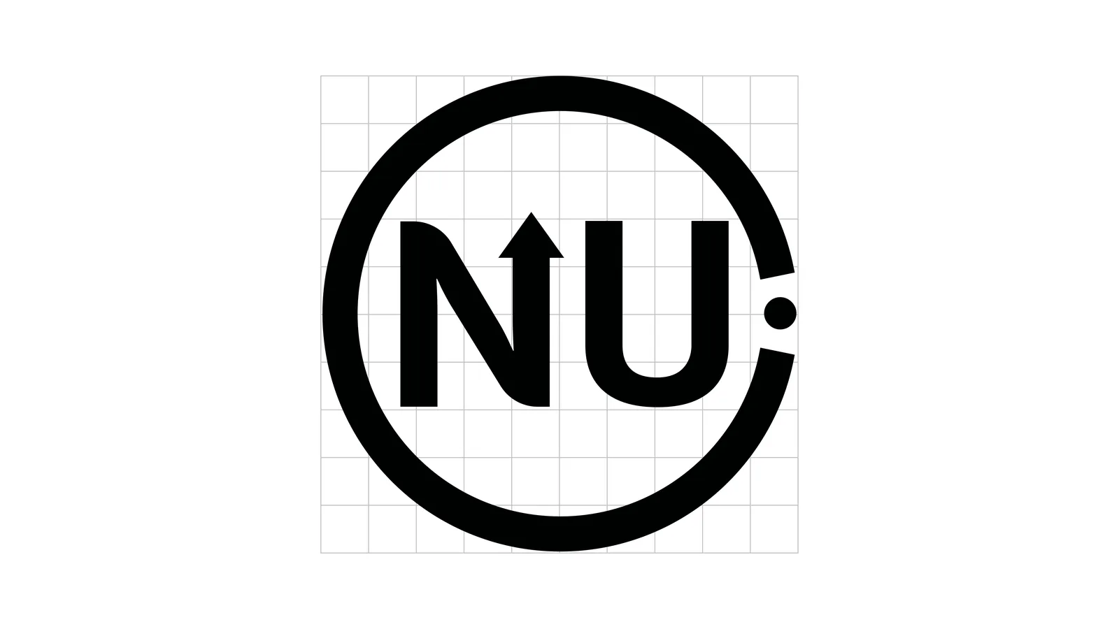
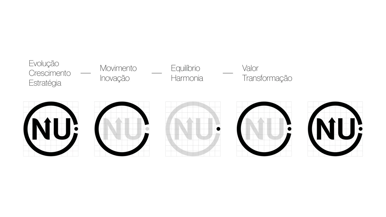
The stem of the N became an ascending arrow, and the semicircle around it closes the C of Company. Both letters, the arrow and the ring came off the same grid, and that is what gives the symbol on its own and the full lockup the same weight on a page.
The type, redrawn
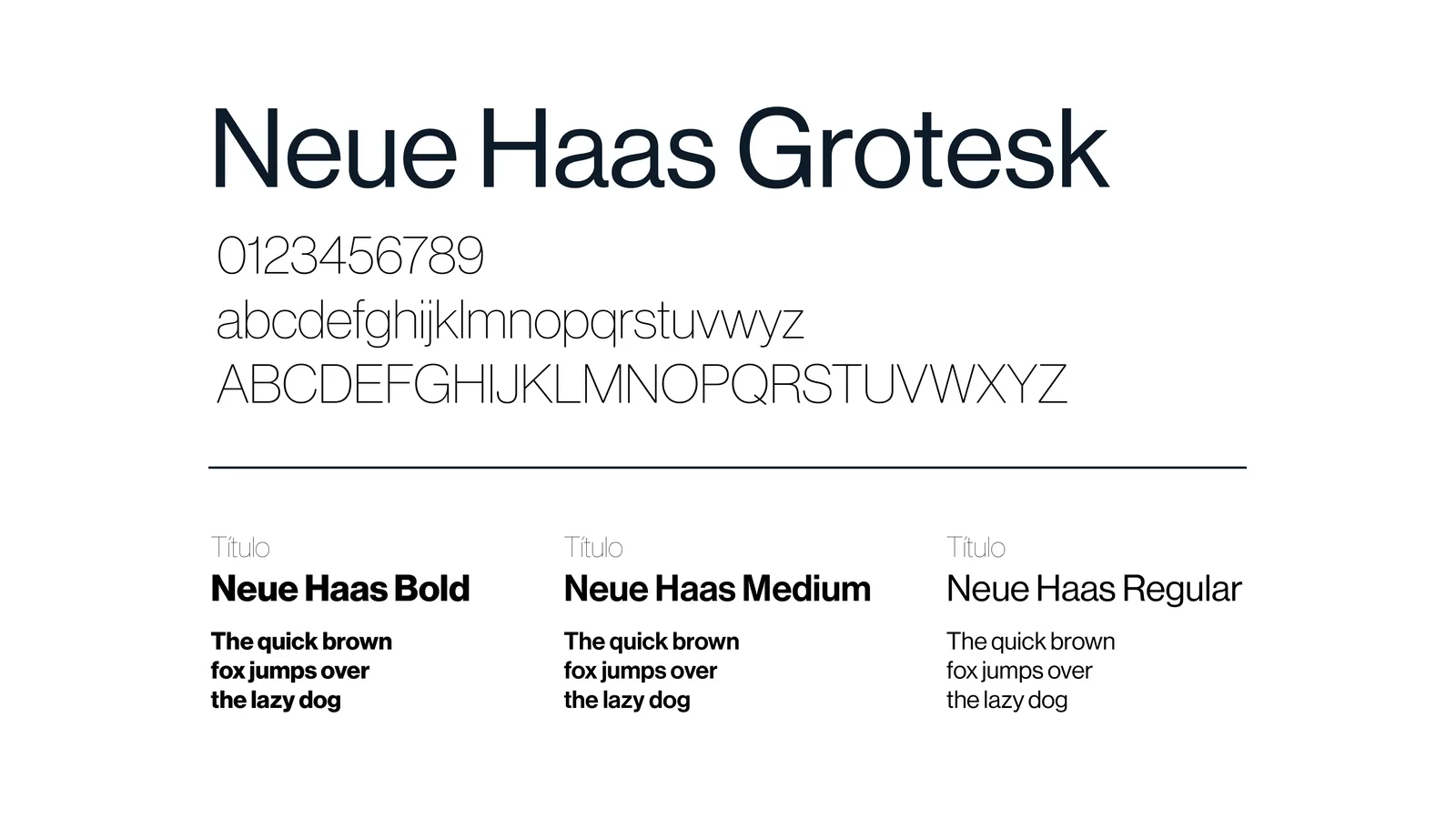
The logotype does not use Neue Haas Grotesk as it comes: it started there and was redrawn on the same grid as the symbol, so the name and the shape share one construction. Neue Haas stayed as the institutional typeface, and Lato came in for body copy, where a display grotesque tires the eye.
Lato is from 2009, the same year NU Company was founded. That did not pick the typeface on its own, but it is the kind of coincidence that closes the argument in the room.
Four colours, in Pantone
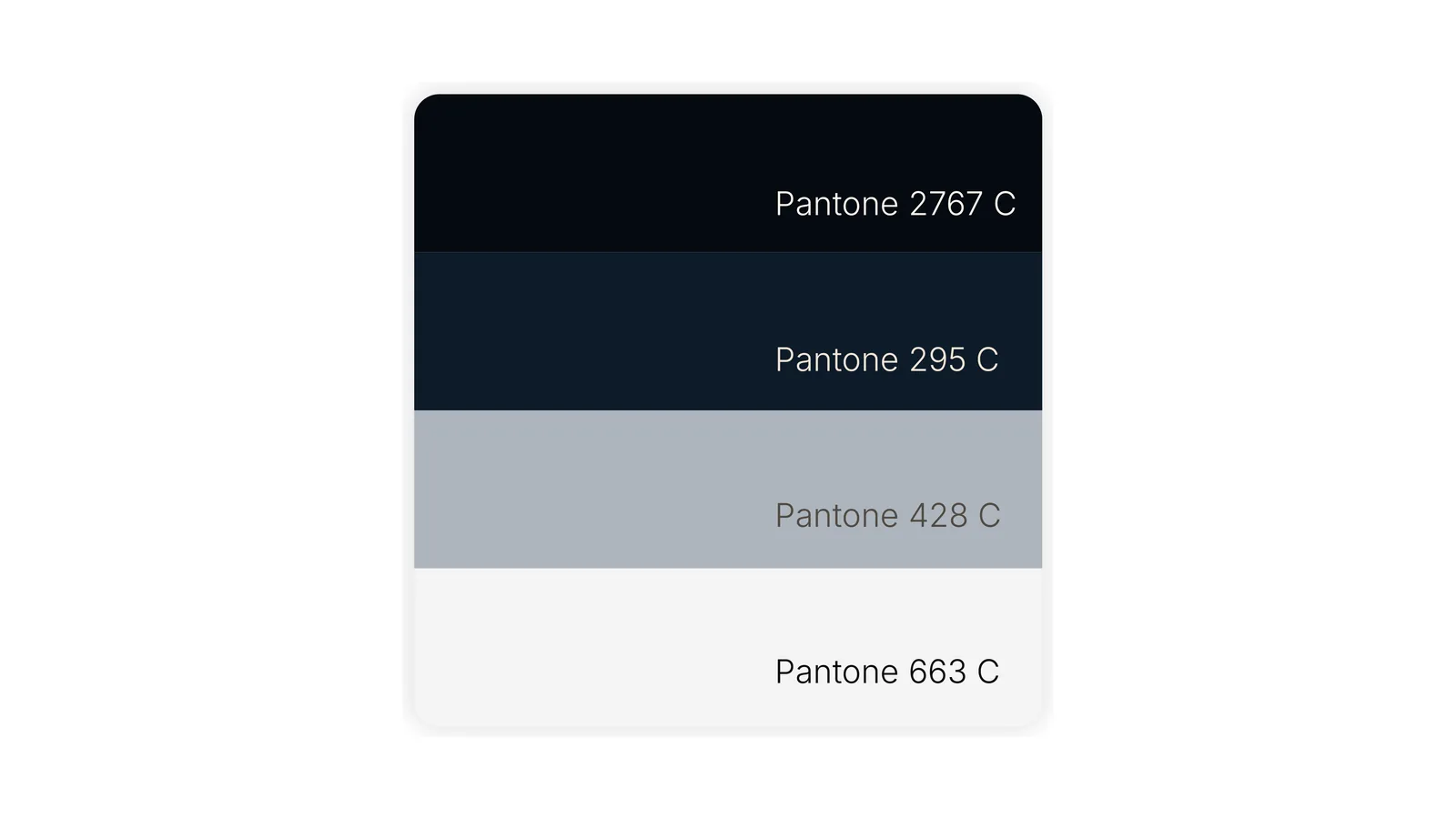
The palette is short on purpose: deep navy, pacific blue, silver grey and white. Four colours give you hierarchy without needing a support colour invented later, when someone asks for a piece nobody planned.
All four were locked in Pantone (2767 C, 295 C, 428 C and 663 C) because almost every application here is physical: façade, uniform, badge, stationery. On a screen the blue sorts itself out. On vinyl and on fabric, without the code, every supplier returns a different blue and the brand arrives different at each touchpoint.
The ring became the pattern
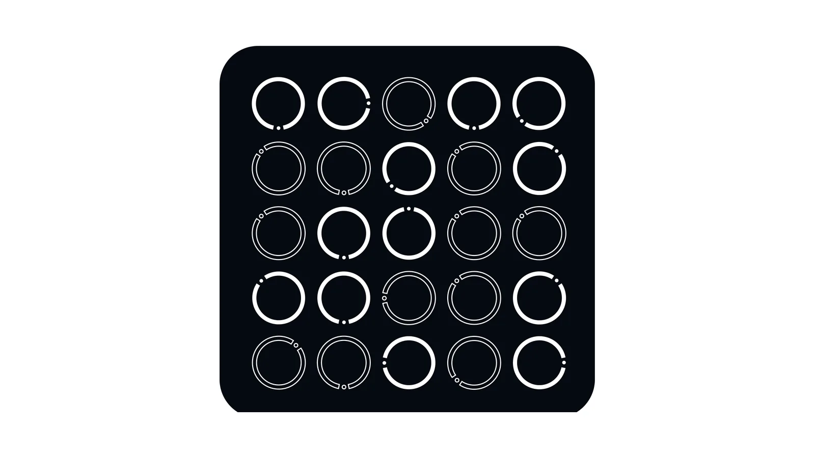
The ring is the only shape the brand repeats, and the pattern came out of it. It is not a new pattern drawn to fill space: it is the same circle, repeated and cut at different angles, which keeps the system running on one part instead of two.
That is what solved the large surfaces. A reception wall with the logo blown up reads as an advert; with the pattern, the brand fills the room without the name being written everywhere.
The brand off the screen
The identity was built onto the applications before it was signed off: façade lettering, internal wall, leadership and staff uniforms, badge, notebook, mug, flask, mousepad and the stationery kit. They are all in the gallery, further up.
That is the test a screen hides. The symbol has to work at two centimetres on a badge and at metres on a façade, which is why it carries no fine detail at all: what is left is a circle, a stem and an arrow.